IGA
Brand Refresh
Design Direction and Design
For Special Group
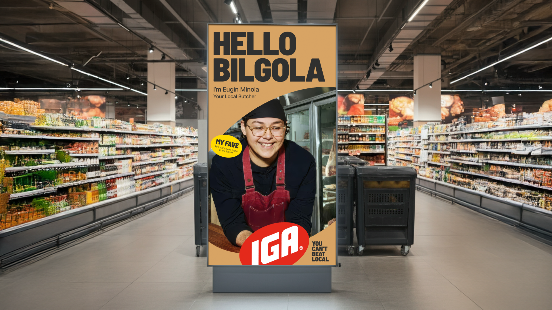
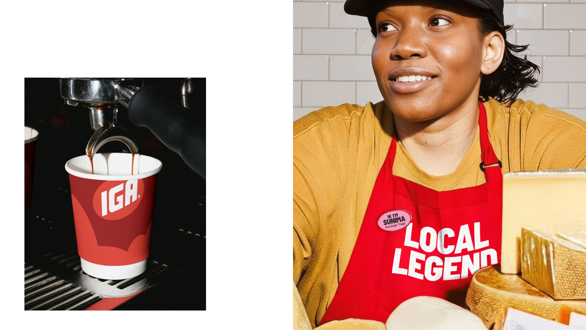
For too long, IGA’s identity leaned toward the generic, leaving the brand at risk of being overshadowed by bigger, glossier competitors. The strategic shift was rooted in transforming "local" from a humble descriptor into a genuine superpower. By leaning into the brand’s inherent pride and savviness, we moved IGA away from the quiet modesty of a market grocer and repositioned it as a confident champion of the neighborhood.
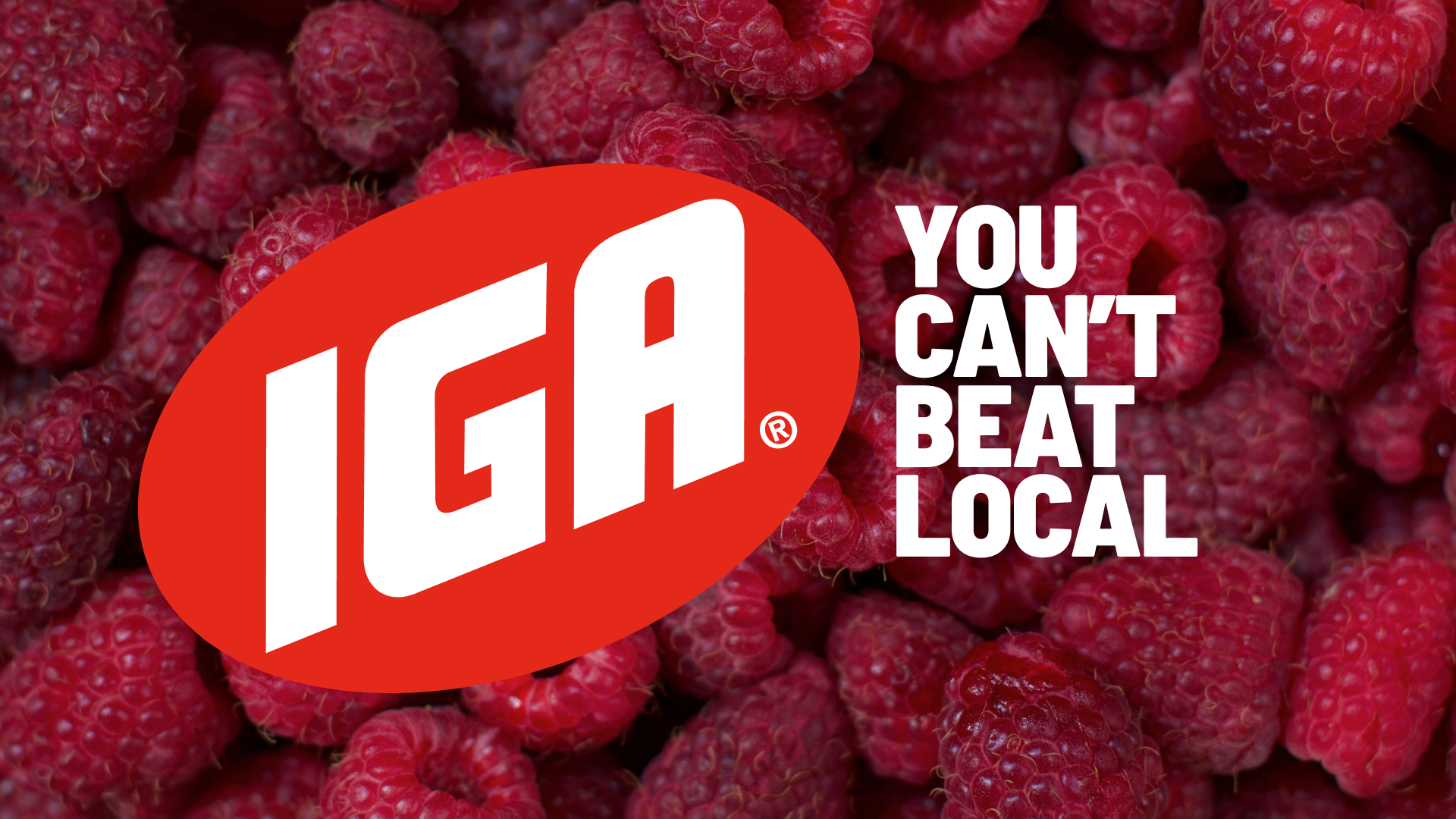
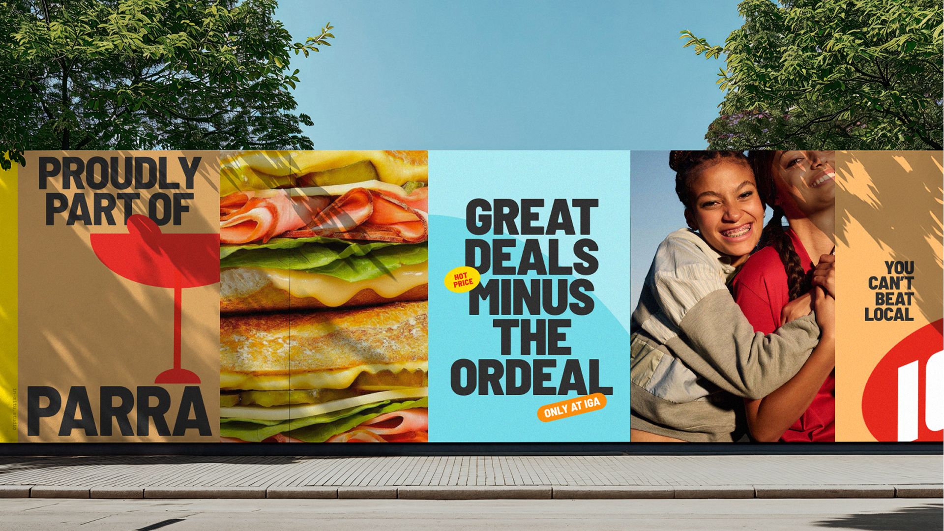
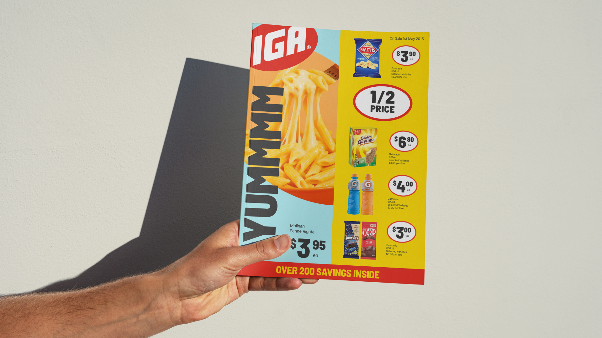
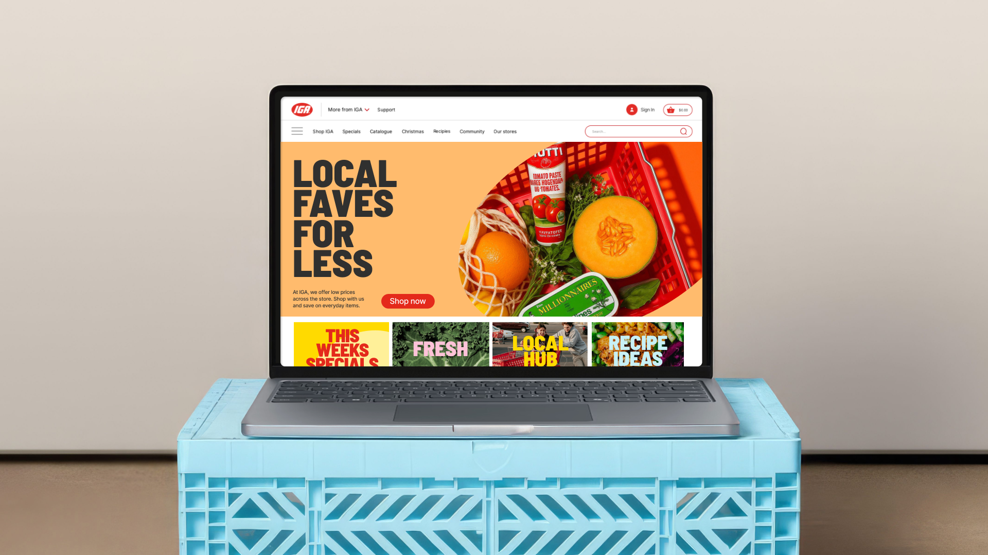
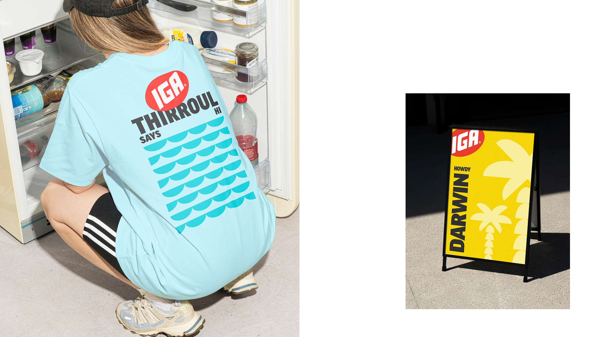
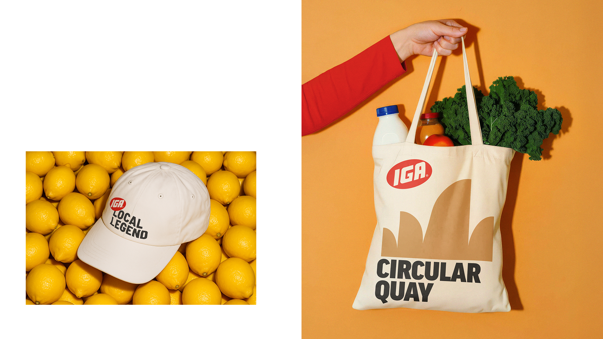
The identity pulses with a high-energy color palette and a rotated logo that injects a sense of attitude and modern playfulness into brand communications. This boldness is balanced by a strategic restraint within the physical retail environment, where the design is stripped back to its bare essentials to ensure clear navigation and a seamless shopping experience amidst the noise of a busy store.
Design Direction and Design
For Special Group
For too long, IGA’s identity leaned toward the generic, leaving the brand at risk of being overshadowed by bigger, glossier competitors. The strategic shift was rooted in transforming "local" from a humble descriptor into a genuine superpower. By leaning into the brand’s inherent pride and savviness, we moved IGA away from the quiet modesty of a market grocer and repositioned it as a confident champion of the neighborhood.
The identity pulses with a high-energy color palette and a rotated logo that injects a sense of attitude and modern playfulness into brand communications. This boldness is balanced by a strategic restraint within the physical retail environment, where the design is stripped back to its bare essentials to ensure clear navigation and a seamless shopping experience amidst the noise of a busy store.